December 2017 rolls around and I’m in the thick of prepping for Twelfth Night as the event steward. On December 1st, Nataliia (The Tyger Clerk) sends me a scroll assignment. I look it over, and then look at my husband. The conversation goes something like this:
Me: Hey, do you think I can handle three scrolls for Twelfth Night? And prepping for it?
Him: I don’t know. There’s only one way to find out.
Me: Truth.
At which point, I replied that I would take the assignment. I have often admitted to liking being in pressure situations. I feel it is when I perform to the best of my abilities. And really, I already had one scroll done minus a few little details. So it was really like only doing two scrolls. Surely I could handle it.
The write up for the recipient was pretty stellar, and all I needed to do was determine what period his persona was playing in. His persona was late period Spanish, so I went digging through the British Manuscript Library. I have to tell you, that is a rabbit hole I could live in for many, many moons. Being so new to scribal arts means that I am seeing all of these images with fresh eyes and getting to “Ooh” and “Ahh” like a little girl watching fireworks.
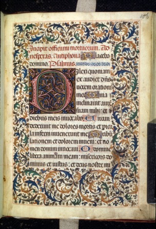
I found this beautiful page of acanthus leaves from a Book of Hours from the late 15th century. I took a quick tutorial with Mistress Camille des Jardins a few months prior on acanthus leaves, and had done some really simple sketching of them on my own. With this is a base, and my light box, I felt pretty confident I could recreate it.
I did a very basic sketch of the vines and the basic leaf shapes to get the layout in place before I started on the calligraphy.
Gothic. Why me? I feel I’ve got a pretty good handle on uncial writing, but gothic is a completely different hand with a different mindset required. It is a very straight line hand and that is something I need significantly more practice with.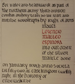 I needed a wider nib, without a doubt. I have both Mitchell and Speedball nibs. The Speedball nibs are wider than my Mitchells, but I’ve gotten used to the Mitchells. I tried to go back to the Speedball and immediately wanted to heave them in to the snowbank to be recovered by crows in the spring. They just didn’t feel right anymore.
I would have to make do with what I had. In looking back at the calligraphy, I learned a few things, all reinforced by Laurels I trust. I needed a wider nib, or to make the spacing between strokes smaller. I also needed a mid line to help keep things uniform in size with my ascenders and descenders. But all in all, I didn’t hate it.
Once the calligraphy was in, I started to paint in the leaves. It’s funny, the few scrolls I’ve 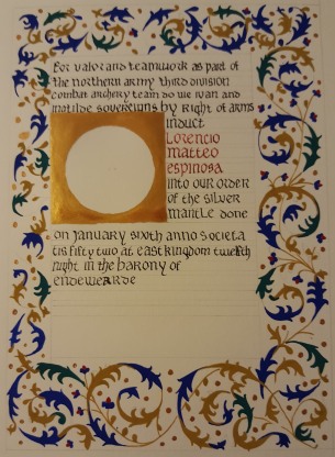 done, I have always hated the first step of blocking in color because it looks haphazard and without detail. The leaves went in with ease, and I just kept telling myself it would look much better once the detail was in place. I pushed the puddles of paint around on the page and then waited patiently for them to dry. I can hear Camille in my ear “Don’t touch the paint!” when I am being impatient.
Once the base layers were down, I was able to go through and add the much needed detail! You’ll see the close ups of that below. Adding in all the fine detail was a process which took a couple of nights. I added all the black lines and red accents one night, and all the fine little white dots on the following night. Camille and Christiana would be proud I didn’t rush the detail work and the paint didn’t get sloppy. There are a few areas where my white dots could have been more uniform, but that is a practice thing. I’ll get there.


The final piece is seen here on the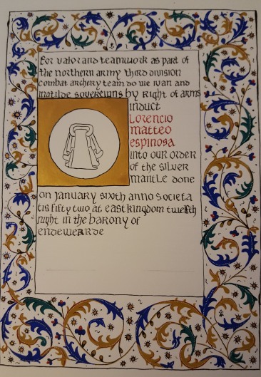 right. The final painted size is 5″x7″ on a piece of 9″x12″ bristol. Overall, I am exquisitely happy about the illumination and moderately okay with the calligraphy. I may go back and practice Gothic writing some more, but for now, I’ll return to the uncial I’m at least decent at! There were definitely lessons to be learned and I am glad to have had the opportunity to do so.
Paper: Strathmore Bristol Vellum Finish 9×12″
Ink: Higgins Eternal Ink, Calli Ink
Nib: Mitchell .75mm left-hand
Paint: Holbein Artist Gouache, Winsor Newton Gouache

it is an amazing scroll…i hope to be as good as you someday
LikeLike